Meridian Holdings
Enterprise Design System
Building a scalable design system for a highly configurable compliance platform — one flexible enough for hundreds of screens, and personal enough for every team that uses it.
Overview
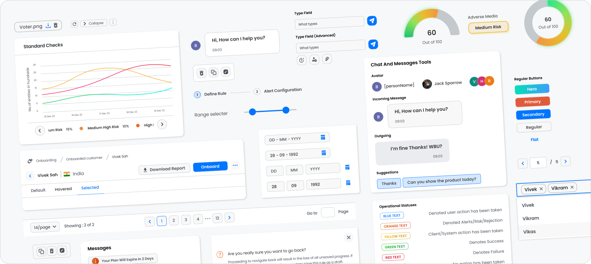
As the Transaction Monitoring platform evolved into a large enterprise ecosystem, maintaining consistency across hundreds of screens, dashboards, graphs, forms, and workflows became increasingly challenging. I led the design of a reusable design system that not only standardized the product, but let organizations and individual users personalize their own workspace without compromising usability or consistency. Unlike most design systems, which stay static inside a design file, this one was built for runtime customization — administrators and compliance officers could adjust themes, layouts, widgets, and visual preferences directly inside the application, with no engineering ticket required.
Role
UI/UX Designer
Duration
1 Month
Platform
Android • iOS • Web
Responsibilities
Reusable Component Library • Typography system • Semantic color system • Design tokens & variables • Form components & validation patterns • Dashboard layouts • Widget framework • Chart & graph components • Personalization controls • Theme management • Enterprise UI standards
Tools
Figma • Adobe XD • Illustrator
The Challenge
One design language, hundreds of screens, and no two organizations wanting the same thing.
Enterprise compliance platforms carry an enormous number of reusable UI patterns — dashboards, forms, tables, graphs, workflows, investigation screens. And every organization using them has its own preferences for data visualization, branding, and workspace layout.
The challenge was to build a
single design language that scaled across the
platform, while still giving users room to personalize their experience — without requiring
engineering changes.
Design Approach
Six problems, one system.
01 / Component Library
Reusable components for enterprise scale
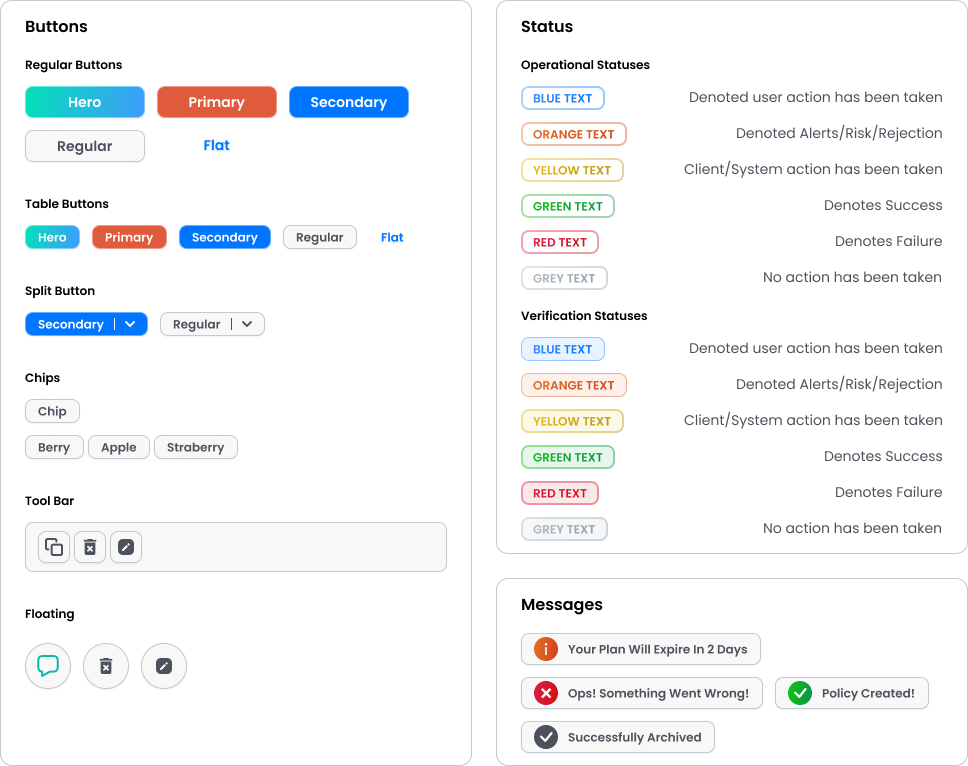
A comprehensive component library covering buttons, cards, tables, filters, forms, inputs, dropdowns, navigation, status indicators, modals, notifications, graphs, workflow nodes, and dashboard widgets.
Every component followed consistent spacing, interaction states, accessibility considerations, and reusable design tokens — enabling rapid development while keeping hundreds of enterprise screens visually consistent.
02 / Tokens
Configurable typography & color system
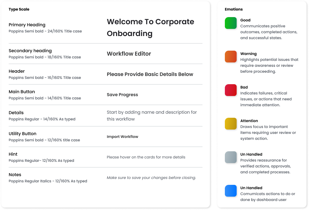
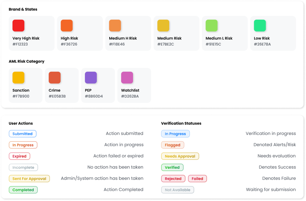
Rather than hardcoding type and color, the system was built around editable design tokens — Poppins across a fixed type scale, and a semantic color system where blue, orange, yellow, green, red, and grey each carry a specific meaning.
Users could personalize their primary and secondary theme colors, density, and corner radius — applied across the entire application in real time. Try it further down the page.
03 / Widgets
Personalized dashboards & widget system
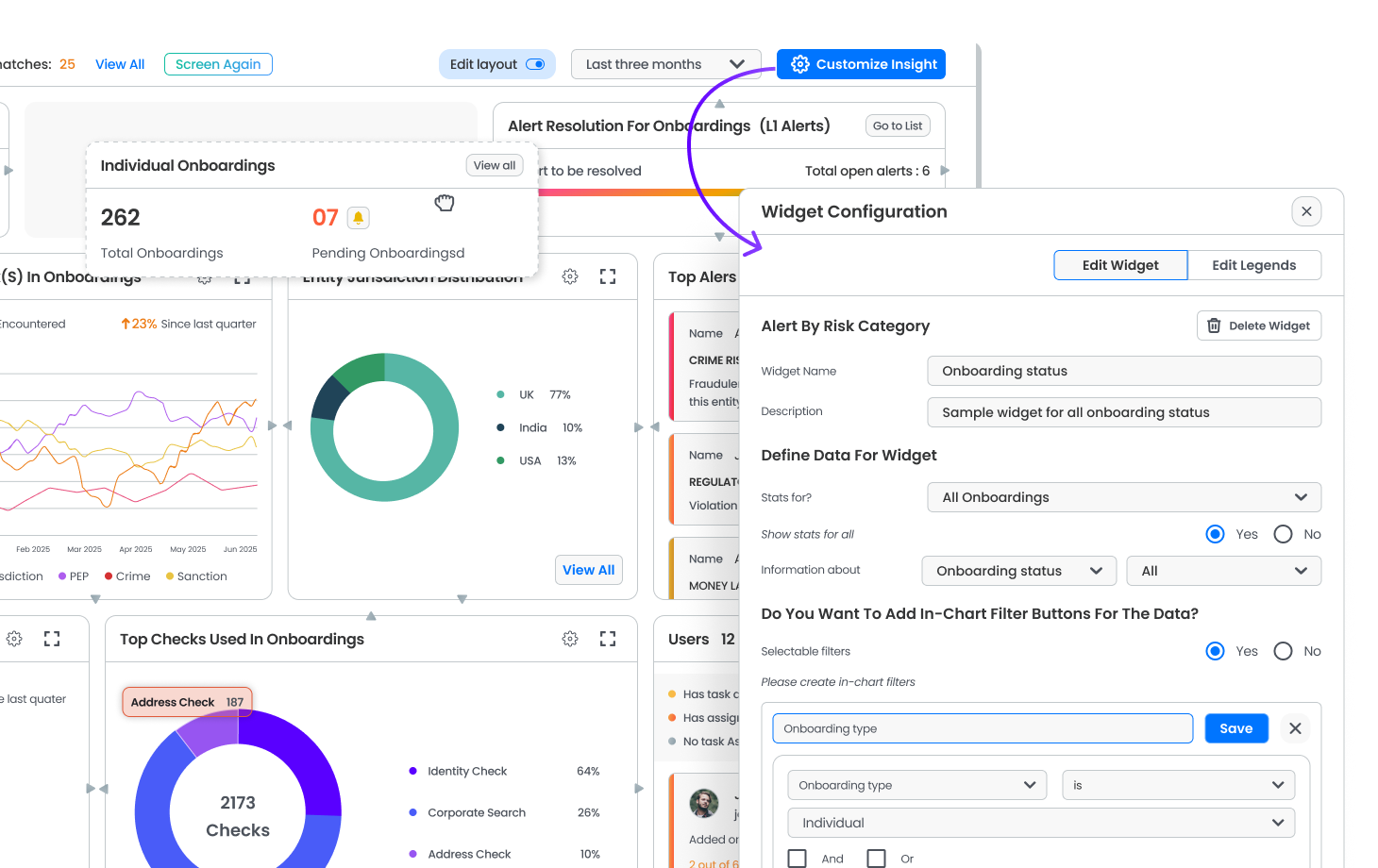
Compliance teams rarely need the same information. A modular widget framework let investigators, managers, and administrators rearrange widgets, choose preferred charts, select visible KPIs, configure legends, and save their own workspace layout.
04 / Data Visualizations
Standardizing data visualization
Reusable graph components, chart legends, and risk scales stayed consistent across AML Screening, Crypto Screening, Transaction Monitoring, and reporting — including a shared six-step risk gradient and a fixed color for every AML category, so the meaning never changed even when the module did.
05 / Forms
Flexible forms without losing consistency
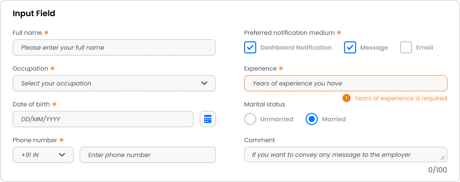
Reusable form components with configurable labels, placeholders, helper text, validation states, required indicators, error messaging, and field layouts — giving implementation teams flexibility while keeping the experience unified.
06 / Rule Logic
An expression builder for compliance rules
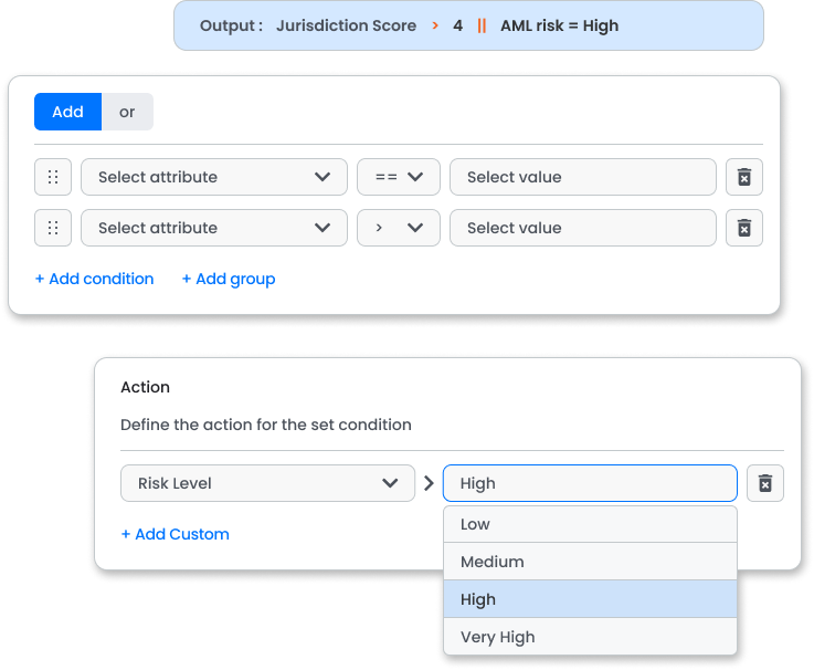
Transaction monitoring runs on rules — "flag if amount > X and country = Y." Instead of leaving that logic to engineering, the system includes a visual expression builder: pick an attribute, an operator, a value, and chain conditions with And/Or — all inside the same component language as the rest of the platform.
The workspace, personalized
in real time.
This is the actual claim behind the token system: change the accent, density, or corner radius, and the whole interface restyles instantly — no rebuild, no developer. The colors below are the platform's own brand and risk tokens.
Theme Editor
Personalize the workspace — colors, corner smoothness, type scale, and layout density, all applied live.
Colors
Case Review - ID: 40281
42
Open alerts
6.2m
Flagged volume
Norvale Trading Co.
Kestrel Partners
100%
Increased Consistency
400+
Reusable Components
5x
Faster Delevery
The visual backbone of the platform.
The design system became the visual backbone of the Transaction Monitoring platform — enabling faster product development, consistent user experiences, and scalable enterprise customization. By combining reusable components with runtime personalization, the platform balanced standardization with flexibility, letting organizations and individual users tailor their workspace without sacrificing usability or maintainability.
Faster delivery
A shared component library and token set meant new screens shipped from existing parts, not from scratch.
Consistent by default
Spacing, states, and a fixed semantic color meaning were built into every component — not re-decided screen by screen.
Personalization without tickets
Theme, layout, and widget changes happened at runtime, with zero engineering effort per organization.
Key Skills Demonstrated
Design Systems
Enterprise SaaS
Component Architecture
Design Tokens
Figma Variables
Dashboard Design
Data Visualization
Widget Systems
Information Architecture
UI Standardization
Runtime Theming
Personalization UX
Interaction Design